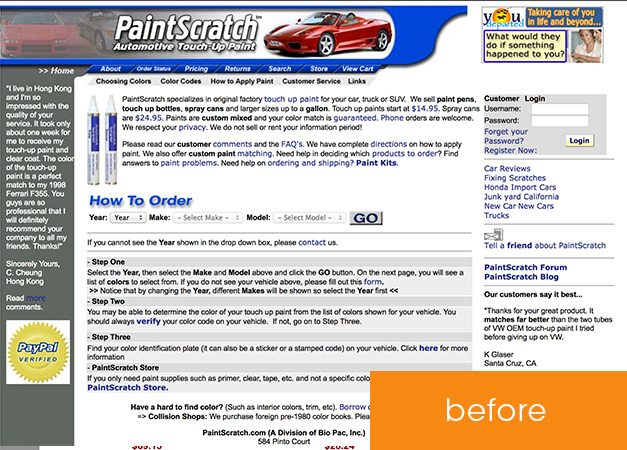
This project was especially interesting because it seemed to challenge every design ideal I’ve come to accept as fact. Along with the site manager, I worked through a host of design iterations, testing and retesting conversion rates. The super-clean, modern designs failed miserably! The convoluted, multi-step processes increased sales! Bright colors everywhere and restricted boundaries seemed to grow revenues. Goes to show that there’s definitely value to trial and error.
In the end, I did manage to clean up the site quite a bit. Much of the work was in the form of copyediting – the original content was pages and pages of bold, italic, underlined text. Every other sentence was so emphasized that there was no hierarchy to the content and it was impossible to tell what was actually important! Now, there are clear titles and subtitles, with a layout that focuses the viewer’s attention on action items.
Services used:

Paintscratch website after redesign